This article shows you how to use the Repeater component to create a template. The Repeater component pulls content from a data set and dynamically places it on a single template page.
The output of the Repeater template is a single page with a long list of items. It kind of looks like a catalogue or list of items.
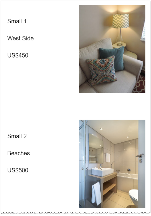
Here is an example. This is part of a page that lists rooms for rent.
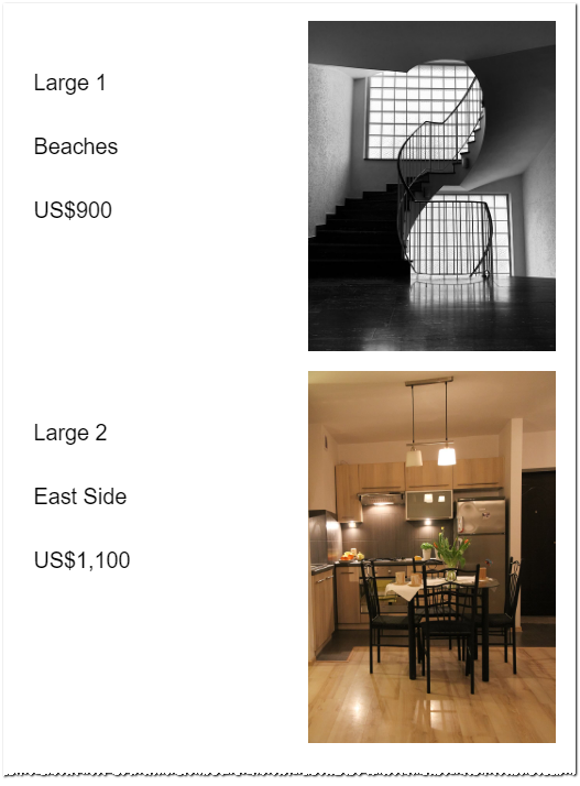
You can place multiple Repeaters on a single page and connect them to multiple data sets. Use the Repeater template on a new or existing page to display content by itself or as part of a multi-level template structure.
Key steps
Here are the key steps you need to follow to create a Repeater template. Each step is described below.
- Open a page.
- Place the Repeater component on a web page.
- Add components to the Repeater
- Map the components.
- Customise components.
- Preview.
- Publish.
More information
After creating a template page, you need to link the template to information in a data set. This linking process is called mapping. For more information, see:
Are you interested in a different type of template structure?
- Select the Details template if you want a separate web page for each item in your data set.
Are you interested in using advanced template techniques to create an engaging user experience?
- Learn how to create a multi-level template structure here.
1 Opening a page
Build a Repeater template on a new or existing page. In this example, we create a new page to display rooms for rent.
- Go to the Website Content page.
- Click the Create page button. A new page displays.

- Select Create a Blank page. A new panel displays.
- In the new panel, enter a unique page name.

- Click Save.
- The new page opens in the Edit Content area.
2 Placing the Repeater component
Place the Repeater component on a page and then connect to a data set.
- On the Edit Content page, locate the components on the left side of the screen.

- Drag the Repeater component to the web page. The Connect with Data panel displays.
- The left side of the Connect with Data panel shows your data sets. Scroll down the list and select the data set you want to connect to the Repeater component. In the image below, we select Rooms for Rent.
- Click OK. The Connect with Data panel closes.
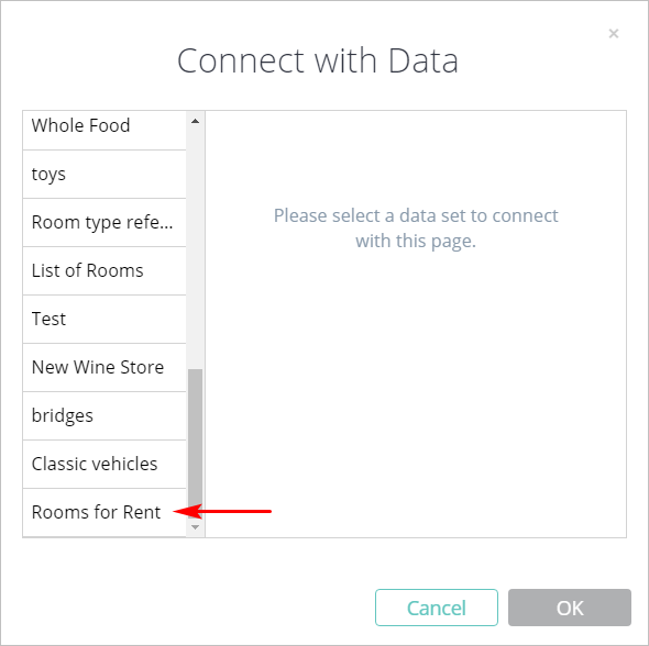
- Click Save and the Repeater component sits on the page.

To learn about custom views, see Creating a Custom View.
3 Adding components to the Repeater
Build your template by placing components inside the Repeater. These components become data fields after you link them to columns in the data set.
- Hover the mouse pointer on the Repeater component.
- Click the Edit Repeater button in the button right corner. The Repeater component opens.

- Drag the required components into the Repeater.
- Move the components around to customise page layout.
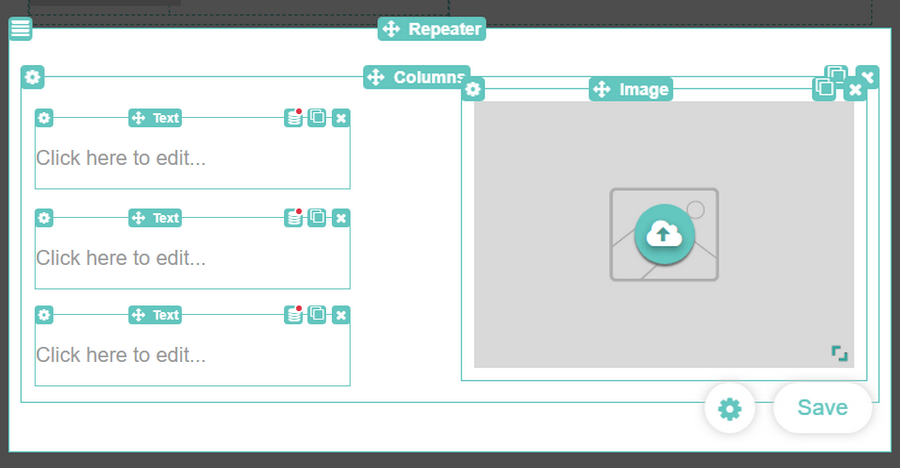
The image below shows our simple template layout. To create structure, we placed a two-cell column inside the Repeater.
- The left cell holds 3 Text components.
- The right cell holds 1 Image component.
4 Mapping components
The next step is to connect each component inside the Repeater to a column in the data set. This connection process is called Data Mapping.
The mapping process described below works for most components. Mapping Image components requires an extra step; see Section 4.1 below.
- Inside the Repeater, hover the mouse pointer on a component. The component toolbar displays.
- In the top-right corner of the toolbar, locate the mapping icon. It looks like a set of CDs with a red dot. The red dot indicates the component is not mapped to a data set.
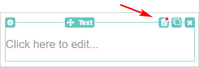
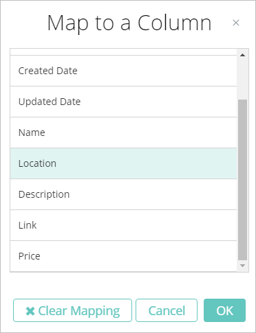
- Click the mapping icon. The Map to a Column panel displays.
- Scroll down the panel and locate the data field you want to connect to the component.
- Click the field and then click OK. The panel closes.
- Repeat mapping for each component in the Repeater.
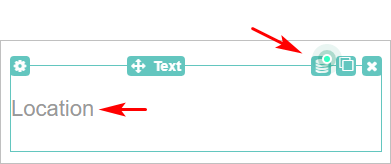
After you finish the mapping task, hover the mouse pointer on a component. There are two visible changes:
- the mapping icon has a green dot which indicates the component is connected to a data set field
- the default text inside the component (i.e. Click here to edit ...) is replaced with the name of the data set column
4.1 Mapping images
Mapping an Image component requires an extra step because the toolbar is different. As shown in the image below, the toolbar on an Image component does not have a mapping icon.
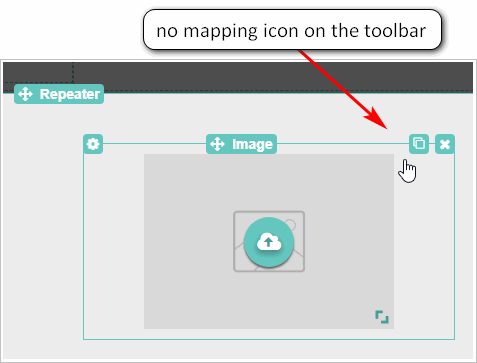
A different mapping approach is required because images contain a lot of data. In addition to the image file, the mapping system needs to manage Alt Text (always recommended for SEO), links, and captions.
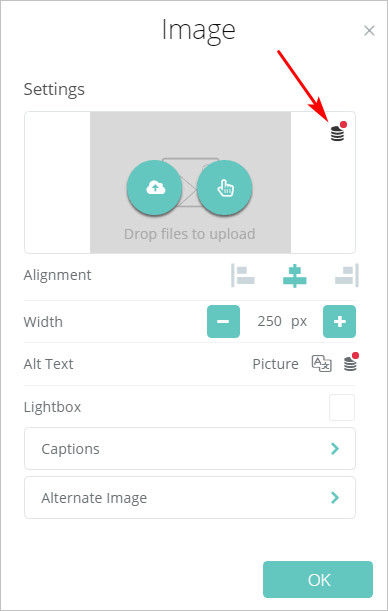
- Click the cloud icon on the Image component. The Image Settings panel displays.
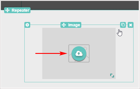
- On the Image Settings panel, click the mapping icon at the top of the panel (not the icon in the middle of the panel). The Map to a Column panel displays.
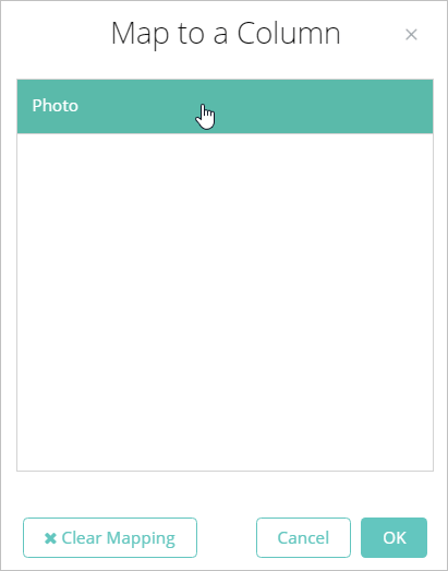
- On the Map to a Column panel, select the image field.
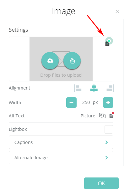
- Click OK. The Image Settings displays again. This time the top mapping icon is green.
- Click OK.
- To test the image mapping, click Preview at the top of the Edit Content page. An image appears in the Preview page.
5 Customising components
5.1 Customising components
You can customize the layout and appearance of any component inside the Repeater. To learn more about customising components, see:
5.2 Customising Repeater settings
You can customise the layout and appearance of the Repeater component. These settings do not change the display of components inside the Repeater.
- Hover the mouse pointer on the Repeater component.
- Click the Edit Repeater button in the bottom right corner. The Repeater component opens.
- Click the round Settings button next to Save. The Repeater Settings panel displays.
Each tab on the Settings panel is described below.
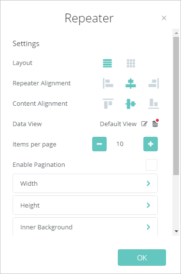
Layout
Choose a layout design: either Rows or Grid. To learn how to use this feature, see:
Repeater Alignment
Change the horizontal position of content: left, centre, or right.
Content Alignment
Change the vertical position of the content: top, centre, or bottom.
Data View
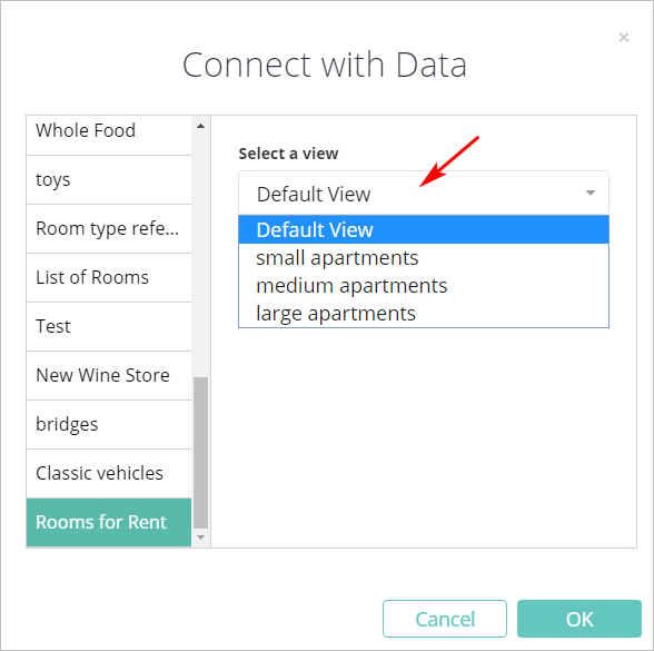
Change the data set view. Click the edit button and the Select a View panel displays. Select a new view from the list and then click OK.
Items per page
Set the number of items to appear on a single page. The range is 5 to 100.
Enable Pagination
This feature is not available yet.
Width
There are two ways to set the width of the Repeater: number of pixels or percentage of the screen width.

Inner Background
This tool places a layer of content closer to the reader; choose a solid colour or an image.
Outer Background
Outer Background content sits behind Inner Background content; choose a solid colour or an image.
Spacing
Click the plus (+) or minus (-) boxes to increase or decrease the padding and margins.

Advanced
To learn about custom styling with ID and Class Name selectors, see:
Configuring visibility lets you control which devices display the content. The default is all devices. To learn about visibility settings, see:

6 Previewing your work
To see your work before publishing, use the Preview tool.
- Scroll up to the top of the Edit Content page.
- Click Save and then Preview. The Preview panel displays.
- See how your template page displays on desktop and mobile devices.
- Return to the Edit Content area and make changes, as required.
- Repeat Preview process.
7 Publishing your work
When you're satisfied with the template page mapping, text styles, design, and layout, scroll up to the top of the Edit Content page and then click Publish. For more information about publishing, see:

Comments
0 comments
Please sign in to leave a comment.