When you create a template page with the Repeater component, you have two layout options: Rows or Grid. This article explains the Rows option and shows you how to use the Grid tool.
Rows option
If you select the Rows option, content on the template page automatically displays in a vertical line even if there is enough space to place some items side by side in a horizontal line.
Below is an example of a Repeater template page with Rows layout. Our data set contains four images of toys. Because we selected the Rows layout, the images only display in a top-down order -- even on a computer monitor.

Benefits of the Grid layout
The Grid tool gives you display flexibility. It is useful when you want to display content horizontally on a template page. It has the added benefit of creating a responsive display. That means your content will automatically look good on a computer monitor, tablet, and smartphone.
Here is an example. We created a Repeater template page with three kinds of food in a data set. The template page displays differently on three devices because the Grid tool adjusts the layout to meet the needs of the display device.
- Displayed horizontally on a computer monitor.

- Automatically adjusted for a tablet.

- Automatically adjusted for a smartphone.

1 Locating the grid tool
- Hover the mouse pointer on the Repeater component.
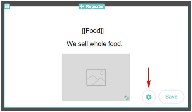
- Click the Edit Repeater button in the bottom right corner. The Repeater component opens.
- Click the round Settings button next to Save. The Repeater Settings panel displays.
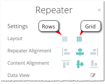
- On the Settings panel, click the grid icon.
2 Customising horizontal display
There are three tools to control how content displays in a horizontal line. You will likely need to test, preview, and adjust the tool settings a few times before finding the display quality that meets your needs.
Each tool is described below.
- Open the Repeater Settings panel (see Step 1 above).
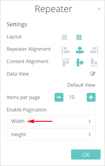
- Click the Width tab. The Width Settings panel displays.
2.1 Adjusting the pixels
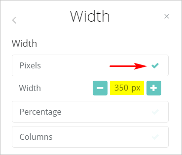
Control the display by setting the width of the component in pixels. This is a less precise method because the amount of content that displays horizontally depends on two factors: the fixed width of the component and the variable width of the screen.
- Click the checkmark on the Pixels tab.
- Use the plus (+) and minus (-) buttons to change the width of the component.
- Click OK at the button of the panel.
- Click Save and then Preview at the top of the page to see how your template displays on multiple devices.

2.2 Adjusting the percentage
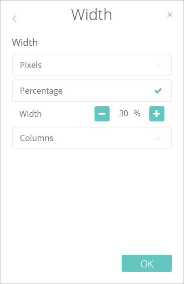
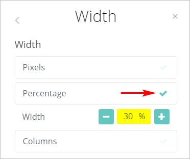
You can set the number of columns that display on each device by changing the percentage. One percentage figure is used for all devices.
By changing the percentage, you change the number of columns. Here are three examples:
- 33% creates three columns
- 50% creates two columns
- 100% creates one column
- Click the checkmark on the Percentage tab.
- Use the plus (+) and minus (-) buttons to change the percentage.
- Click OK at the button of the panel.
- Click Save and then Preview at the top of the page to see how your template displays on multiple devices.
2.3 Adjusting the columns
This tool is similar to 2.2 above with one important difference: you can set a unique percentage figure for three different devices: desktops, tablets, and smartphones.
Unless there are special circumstances, 100% is recommended for mobile devices because it maximizes display quality.
- Click the checkmark on the Columns tab.
- Hover the mouse pointer on one colour bar.
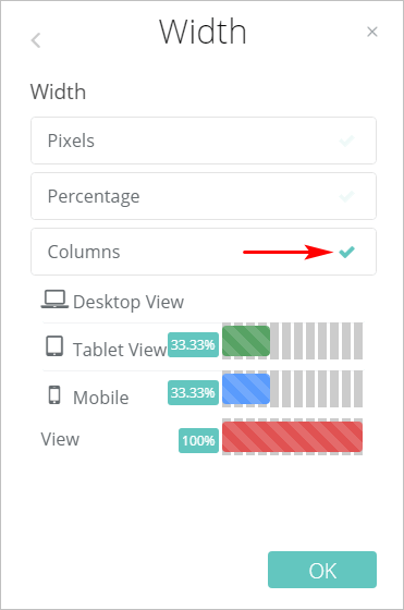
- Slide the mouse pointer from left to right to increase or decrease the percentage width. The length of the bar and the percentage figure both change as the mouse pointer moves.
- Repeat for each device.
- Click OK. The panel closes.
- Click Save and then Preview at the top of the page to see how your template displays on multiple devices.

Comments
0 comments
Please sign in to leave a comment.